So my very FAVORITE television show in the entire world is Adventure Time... I don't know if it's the innocence, the pure silliness, or what, but that show always takes me to my calm, happy place. If you watch the show, then you probably know that season two was recently added to Netflix, finally (Errr... a month ago. Clearly I am on top of these things). To commemorate the occasion, I did a manicure inspired by one of the characters: Finn's on-again, off-again girlfriend, Flame Princess!
 |
| http://25.media.tumblr.com/02afc8d63a53139daa5dfbbd6aed4627/tumblr_miya1cr95B1rd0rbzo5_500.gif |
While I would have a super hard time choosing a favorite character (just kidding, it's Jake), Flame Princess is right up there. The weather in Buffalo has been pretty nice lately, so I thought some bright colors would maybe nudge me into a more springy mindset. Here's what I came up with!
 |
| This is actually after I'd been wearing it for about five days... one of the longest wearing manicures I've had in a long time. Barely any tip wear! |
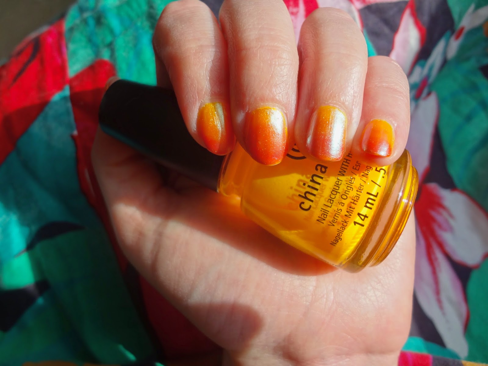
For this mani, I did a sponge gradient and topped it off with an iridescent polish. These are the polishes I used:
- Base coat: Sally Hansen Hard as Nails - Hard as Wraps
- 2 coats China Glaze 'Sun Worshiper'
- Sponged from middle of nail to free edge: Wet n wild Wild Shine nail color in 'cursed'
- Sponged onto free edge: Essie 'Geranium'
- 1 coat Sinful Colors 'Let me Go'
- Top coat: Salon Perfect top coat
Sun Worshiper was a gift from my lovely friend Mary that came as part of CG's 'On the Dot' set. It is an absolutely exquisite highlighter orange neon. It is probably one of my absolute favorite colors in my collection due to its uniqueness and super punchy color. The formula is typical of a neon; it dries matte, and for the fastest punch of color it's best layered over white. Personally, I prefer neons over my natural nail; I always end up with white peeking out around the edges and it ends up looking sloppy... but that says more about my technique (or lack thereof) than anything!!! I only used two coats (because I was adding more), but this polish is opaque in 3 thin coats.
 |
| Again in bright sunlight. Here, you can see the tip wear on my thumb... the beginning of the end!!! |
'Cursed' is a bright, medium orange crelly that is part of their recently released Street Art collection. It's the orangest orange I have... if that makes any sense! Most orange nail polishes I come across lean yellow or coral or red, but this one is just crayon orange. It's very sheer, and requires 4-5 coats for opacity depending on thickness. For a gradient, this was actually a super convenient finish. I'm generally not a fan of the visible-nail-line look, but if you are looking for a sheerer orange, this is a great color. The formula is very workable, not super streaky. I definitely see myself using this a lot this summer!
'Geranium' is a very popular polish, and for good reason. It's an orange-leaning red (or red-leaning orange?) cream with excellent opacity and formula. It's a color I find myself reaching for a lot, but there are a lot of very similar colors out there (even within the Essie brand... 'Clam Bake' and 'Fifth Avenue' are pretty similar in shade). Still, the formula really can't be beat, and I will buy it again when this bottle is gone! Opaque in one coat.
 |
| Indirect sunlight... the wear on the tip of my thumb is making my eye twitch! Perhaps next time I will take photos BEFORE my manicure starts to self destruct... |
Sinful Colors 'Let me Go' looks absolutely magical in the bottle... a
swirly purple-blue-green duochrome that makes me think of fairies or unicorns. As I expected when I purchased it, it is VERY sheer, but it looks awesome over undies. The shimmer leans light green to white, and is really quite subtle and nice. Even though the shimmer is suspended in a purple base, it does not seem to affect the color underneath (as you can see here). Layered over dove gray or lavender, I imagine that you could get the color as it appears in the bottle in two thin coats. Otherwise... probably five coats, maybe six. On a side note, the name of this polish is just so serious and sad, it's a little depressing... pretty heavy for a nail polish I think.
 |
| IT'S SUMMER, DAMN IT. |
I was waffling a bit on whether I liked the iridescent shimmer over the gradient, but I think it added an interesting dimension. It seemed to hide the gradient somewhat, especially in bright artificial light, but as a result the gradient felt like a hidden Easter egg that you could only see in the right light. Anyway, it was fun :^)
So on that note, I am going to go watch some Adventure Time... thinking about an AT nail art mani in a few weeks. Perhaps, perhaps...
Have a great weekend!


No comments:
Post a Comment